Could anyone predict the future of Thomas Cook?
Our team at Matatika were asked to think about how the unexpected collapse of Monarch and Thomas Cook could be predicted. Like many people we meet, our prospect has the feeling there is huge value in their data, if only they could get access to it and ask the right questions. Trouble is, the experts with the knowledge and questions often don’t have access to the data they need.
1) First we need some data
We had access to around 121 million flights departing within the EU during the period 2009 to 2018. This dataset was relatively small, ~5GB and one file per month, but way too big for Excel.
We could join this with Civil Aviation Authority (CAA) data for UK airlines (https://www.caa.co.uk/Data-and-analysis/), summarised passenger numbers and financial information, which they make openly available on their website. These are downloadable as CSV files and small enough to be usable directly in Excel, but they are not easily combined or analysed.
2) We need to clean, crunch and analyse the data
We sync’d all the files to AWS S3 (cloud storage) and processed the data with AWS Glue (a serverless Apache Spark based platform). Partitioning, copying to cloud, adding columns (e.g. Year, Month, Qtr, calculating delays), merging rows (e.g. airlines have changed their IATA codes), and populating the data catalog was 99% of the work. Very painful considering this is just infrastructure part to get to the point of asking a simple question.
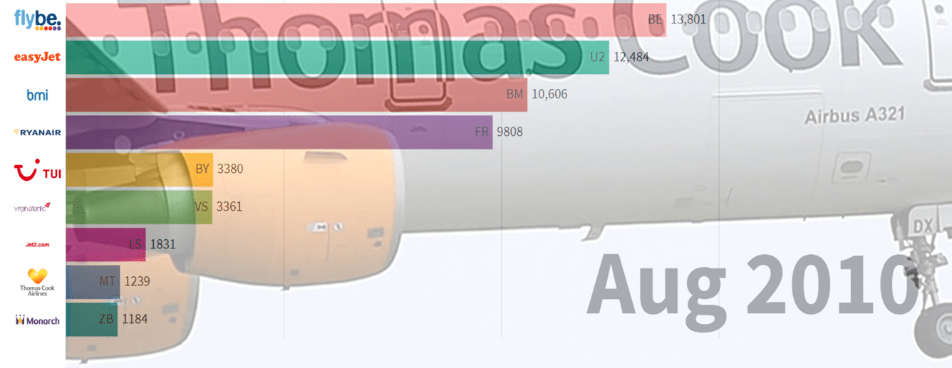
An initial “question” we wanted to answer was simply – Which airlines had the most disrupted flights each month?
This ‘data science’ code is just one line amongst the hundreds of lines to clean and process the data – only one line, but still not very pretty. This line groups by airline, calculates the percentage of flights delayed or cancelled and puts the results into a pivot table by month and year
pivot_df = flights_df.groupBy([‘AirlineCode’]).pivot(“YYYYMM”).agg(round(avg(when(col(“disrupted”), 1).otherwise(0)) * 100, 2))
3) Final step, we’d like to see some results in a lively racing bar chart
Using a racing bar chart does make the data come alive, but this is also easily represented as a line graph. We used the Flourish platform to produce the chart. Which required more data manipulation to link to an image, format the columns, and remove some data we weren’t interested in (we wanted to include RyanAir, but dropped the regional carriers Loganair, Aurigny, Blue Islands). You can see the project for yourself here: https://public.flourish.studio/visualisation/776220/
How can you use your data better?
Visualising the data can reveal some hidden insights, but real value requires deeper digging. With this pretty racing bar chart you can see:
– which airlines are most seasonally affected with strong flight numbers in summer and weaker in winter (generally the holiday companies)
– you might be able to spot a correlation with flights and passenger numbers. E.g. Thomas Cook had a small drop in passenger numbers last year, but increased total numbers the previous few years.
– Looking at this visualisation, you might think TUI were in trouble starting from end of 2012, 2013, and throughout 2014. However, the data is slightly misleading here too with a gap in the flight information, probably due to the reorganising of Thomson (TOM) into TUI (BY).
To get real value from your data we to put data science into the hands of your experts. A subject matter expert, enough linked data, and with good tooling, would be able to provide the insights to forecast issues with Thomas Cook or Monarch.
Let’s create a better data platform?
- A simpler way to navigate the schema and a small amount of the data during the initial data onboarding phase.
- A smart schema transformation to make the datasets easier to combine.
- A data integration layer that makes it easy to trickle in, batch in, trickle out, batch out.
- All the jobs and data science pieces should be linked to a source code repository and releases managed through code.
I hope you’ve enjoyed this Byte Sized Insight. Get in touch if you’ve seen anything that sparked your imagination and simply Click Subscribe to get our insights direct to your inbox!

Connect to Apps & Data now
Use Matatika to rapidly produce insights from more than 500+ apps and community sources

Data Leaders Digest
Stay up to date with the latest news and insights for data leaders.